Summer creativity is the best, especially when I got to attend the Create NJ art retreat, and "go to" a 6 week camp for all things creative! So, recently I found an intersection between the wonderful class I took with Nathalie Kalbach at Create and Camp Scrap with May Flaum. Note: you can still sign up for all four sessions of Camp Scrap for $28 ( a huge bargain - May has tons of videos, ideas, etc. to share) by August 6, after that the price changes.
I first "met" Nathalie online when I starting taking Creative Jumpstart, and it looks like there will be one for 2015 - yay!! Now, at the Create retreat, I got to meet her in person, and that was a wonderful experience!! It's like getting to meet one of your heroes, someone you have admired for a long time. This time, the teaching was personal and we worked in acrylics, which is a medium I have not done much work in before, so did I LEARN A LOT? Oh yes!
I worked in my Dylusions art journal, and it love the bigger size of this one.
Here I am playing with colors and different ways of laying it down, and then some stamping. So how did Camp Scrap intersect? Well, one of the challenges was to work with colors you would not normally choose. I must say for me, pinks and orange are not my go to colors, perhaps from living in a male household (pink). But, the challenge made me go for something different, and I am glad I went beyond my usual boundaries. I'll be going back later to these pages and add to them at some time.
Here is another. We did a critique in class of a page we liked or disliked. I chose this one before I made the change to it. It was just too chaotic. So, I took up the suggestion of using a stencil and white paint to go over it, and I like it much better. I also learned that Dylusions sprays will react with the paint, so once again you see a lot of pink.
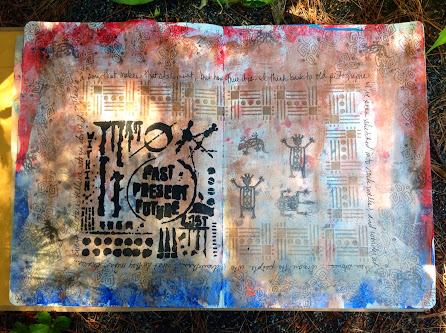
At Camp Scrap one of the By Design sessions focused on a square within a square, and that was my inspiration for these pages. Once I toned down the red, white and blue with some bronze, I liked I the page even better.
I had fun using my new Seth Apter and Patti Tolley Parrish stencils, and some petroglyph style stamps I' had for years. Some stencil detail below...
And now to my favorite pages...love this technique Nathalie taught us! I am not a fashion magazine kind of gal, but I have a new use for them now!!
Details...
I am loving my wild, wacky women!
Thanks for all the inspiration May and Nathalie!!


Your pages are beautiful and love the colors out of your comfort zone.
ReplyDeleteGorgeous pages! It was so much fun to finally meet you in person! Rock out the comfort zone ;)
ReplyDeleteFun stuff, Maura! I especially like your fashion models turned funky and cool.
ReplyDeleteso much fun!!!! Love seeing what you did and those fashion magazine ladies are awesome!
ReplyDeleteAmazing looking journal pages and your so brave with colour, love them.
ReplyDeleteJulie x
Way way way cool Maura!!!
ReplyDeleteGreat grouping of pages. I love all the vibrant colors and layers!
ReplyDeleteThanks Seth!
Delete